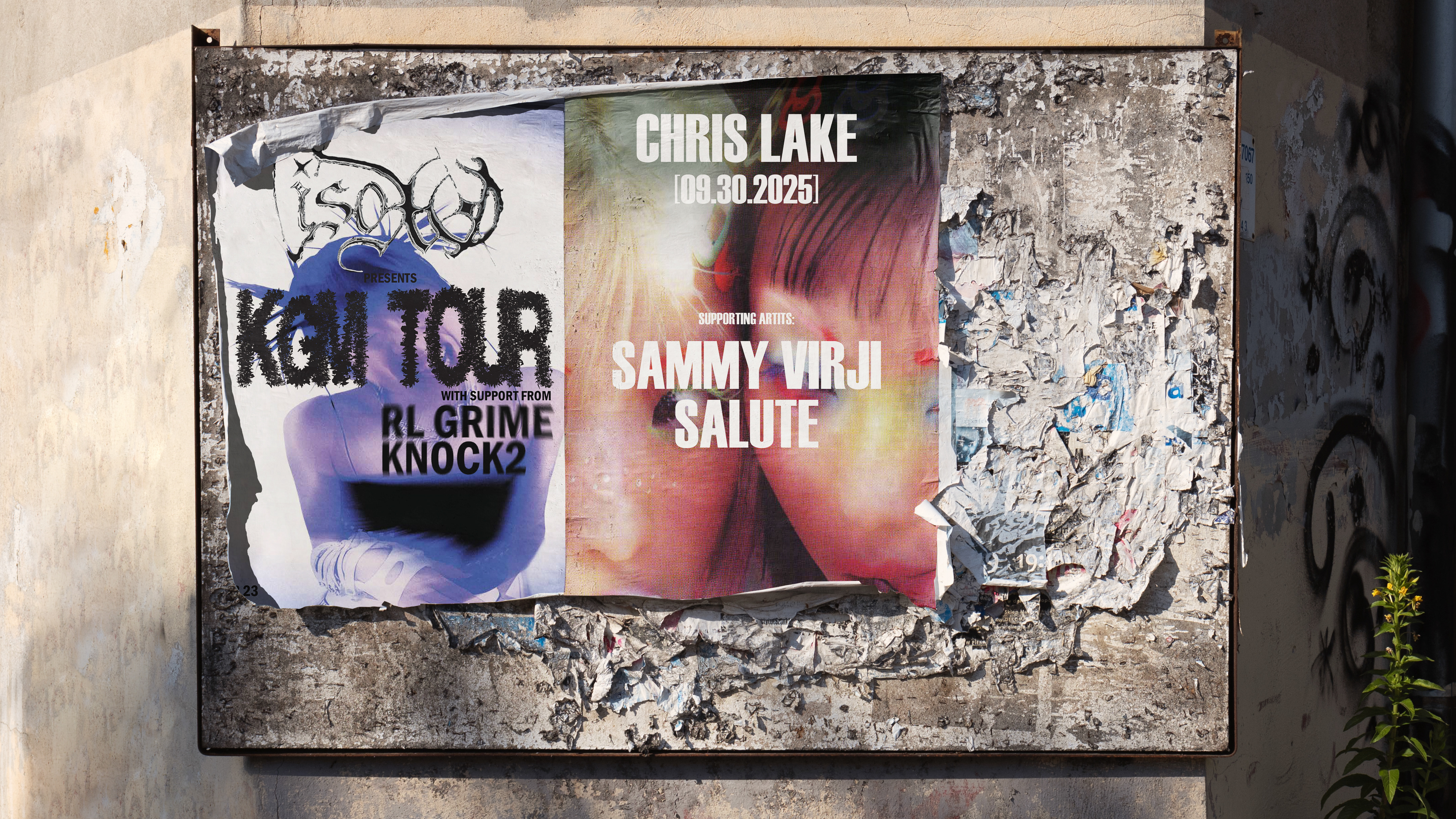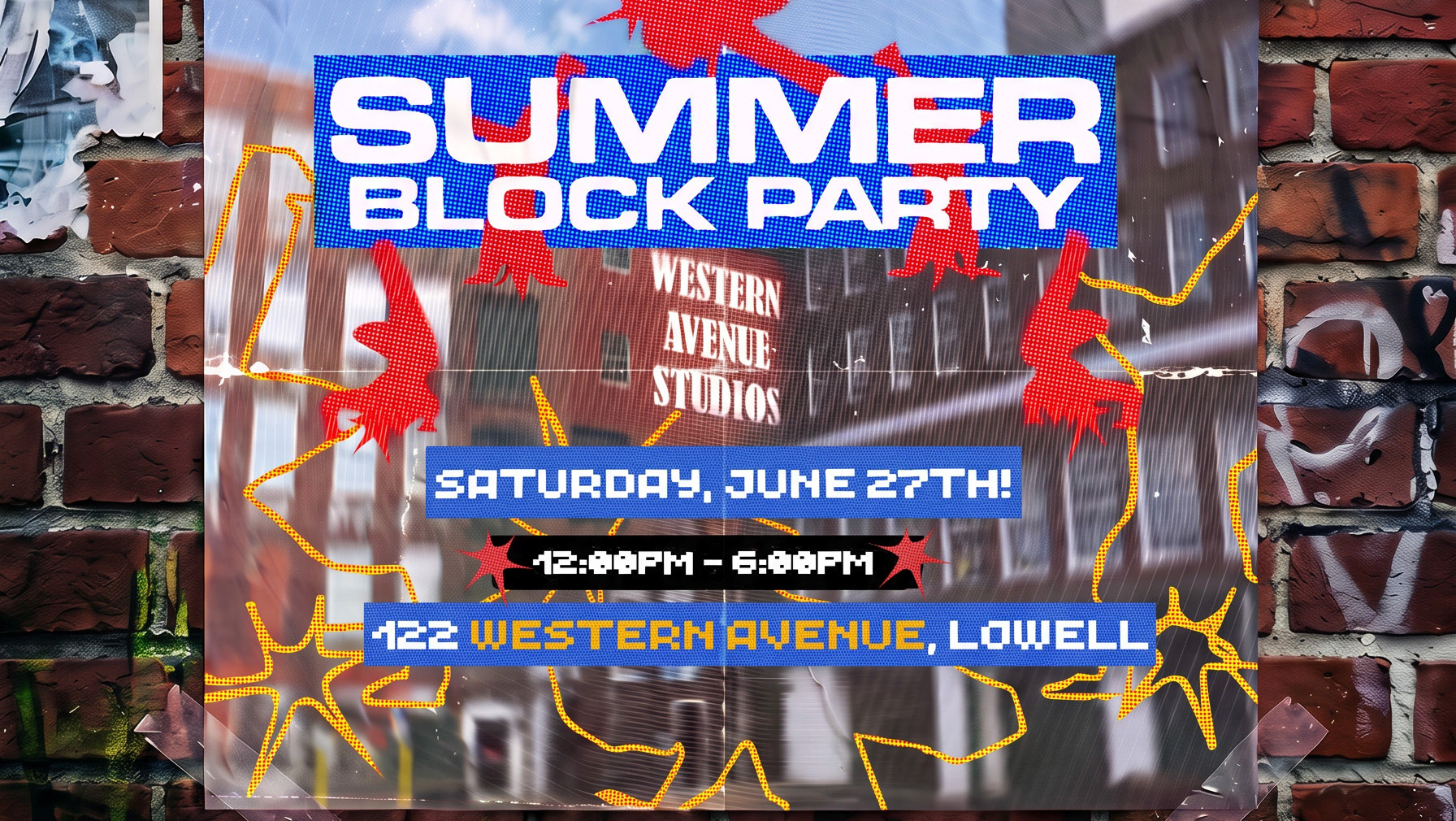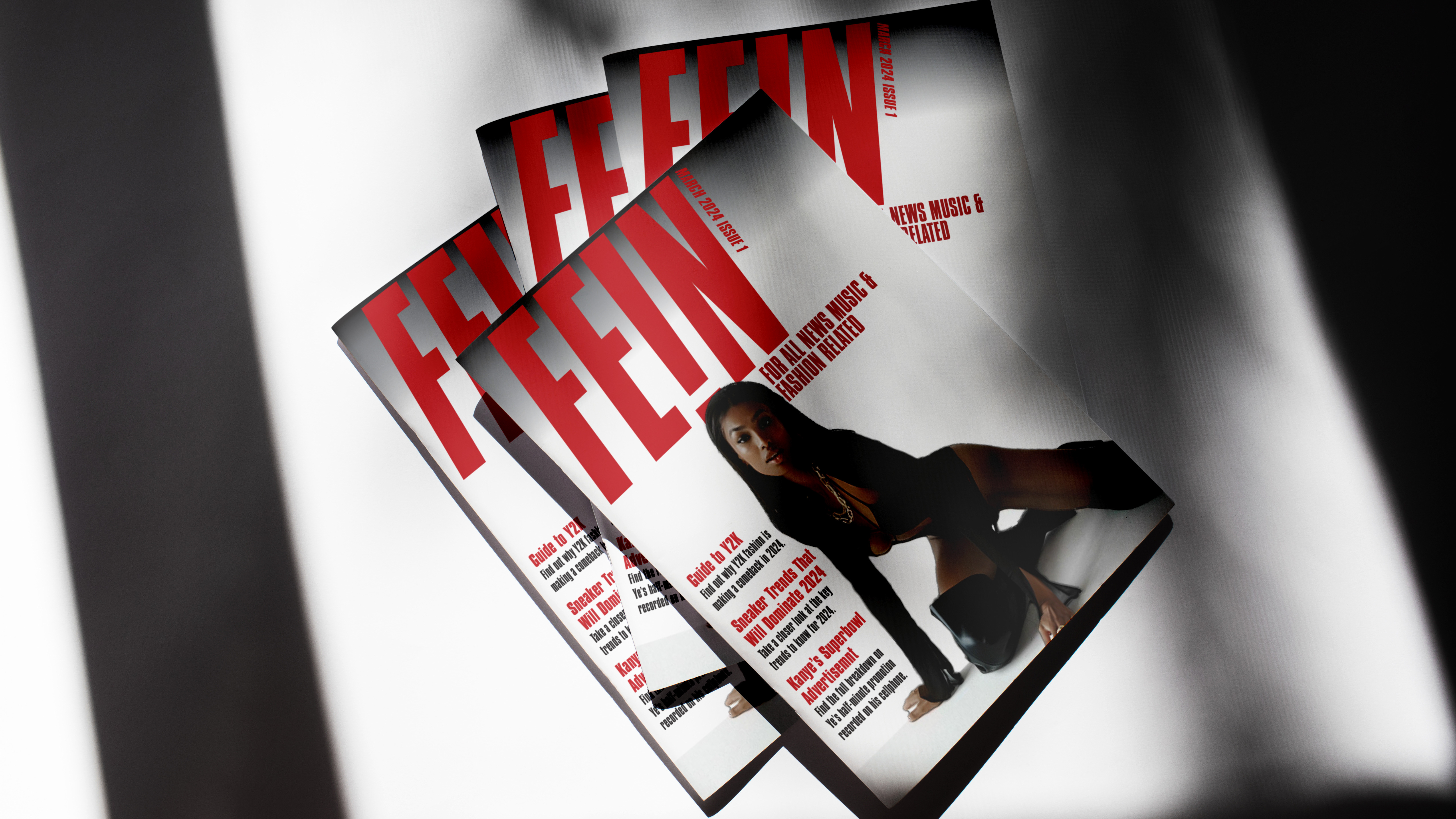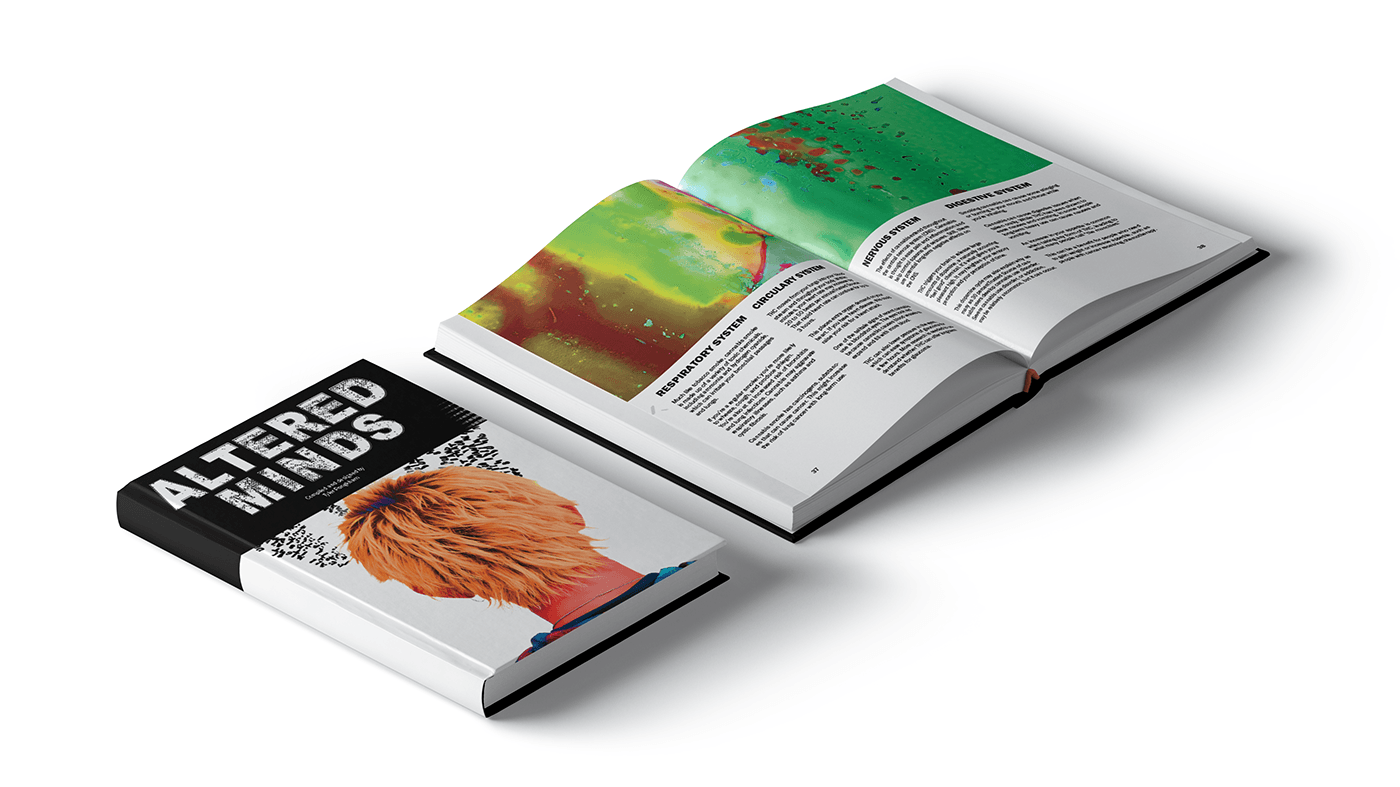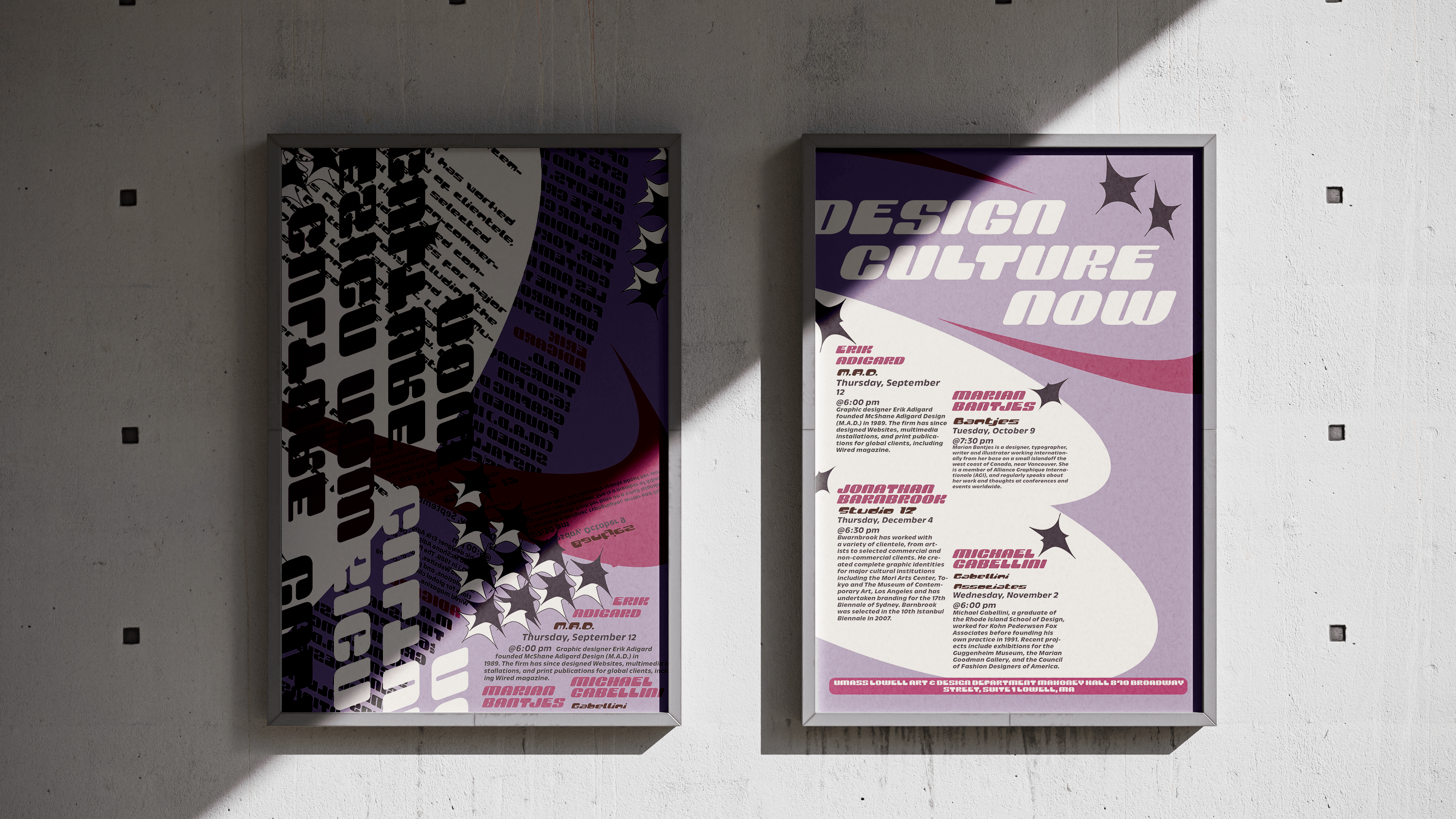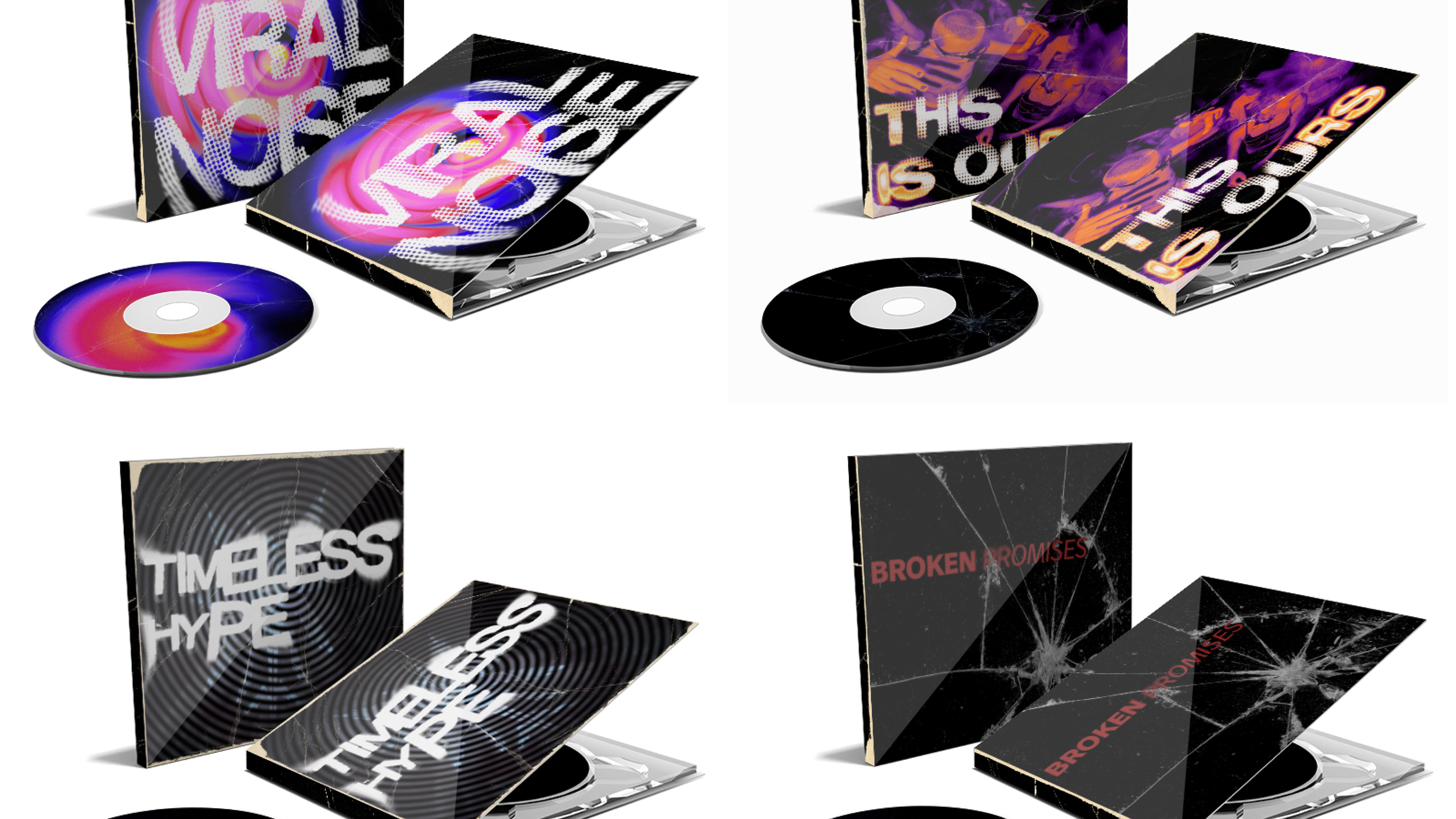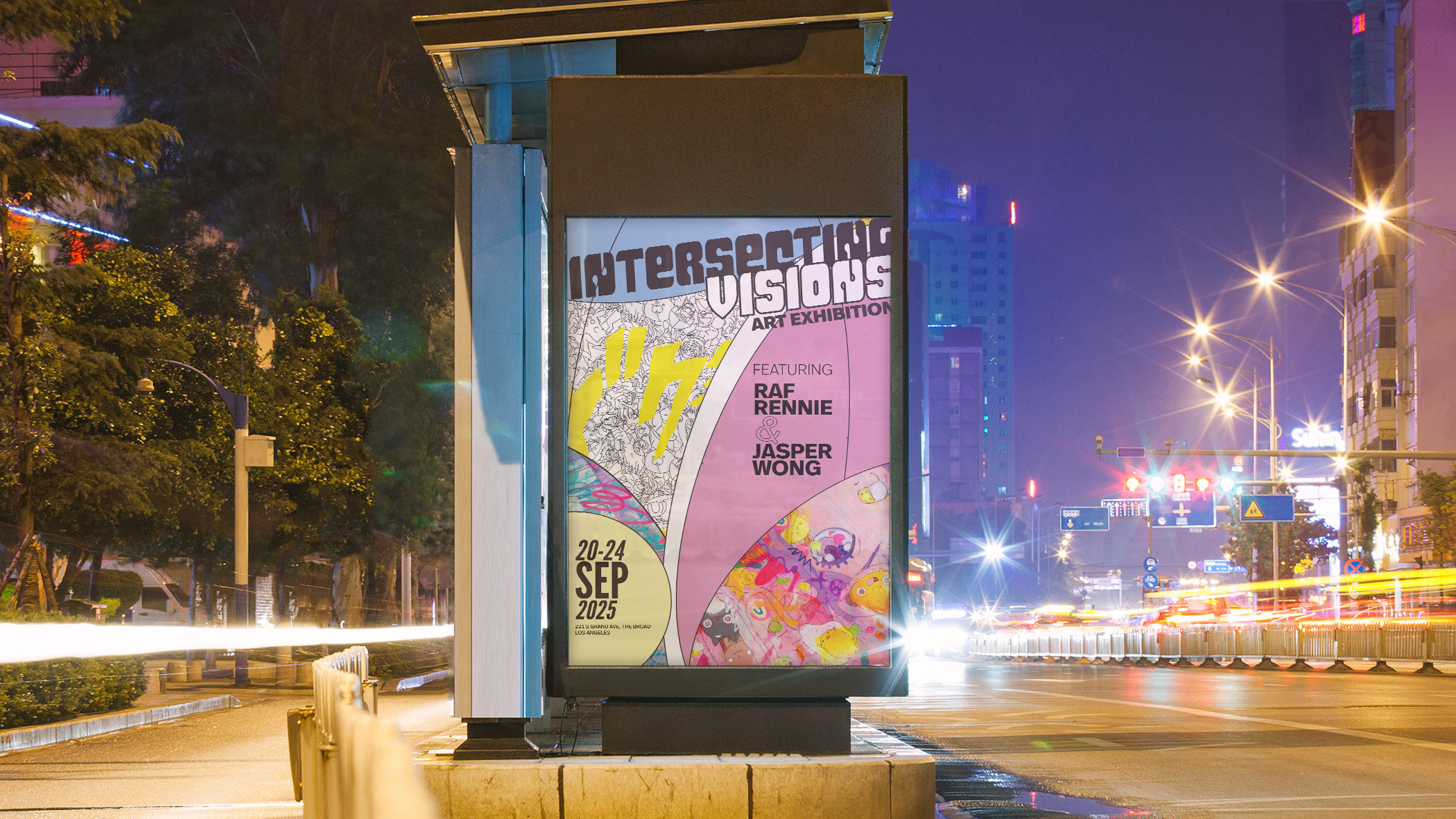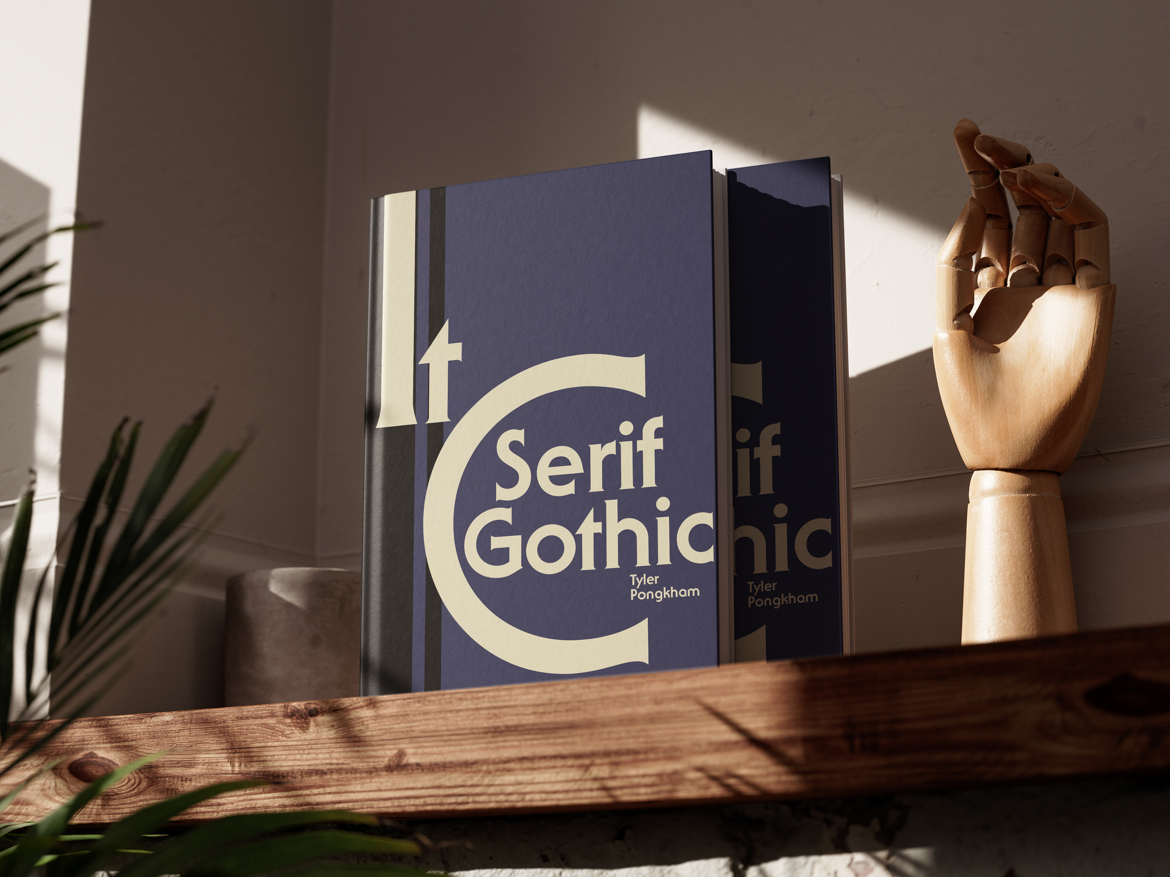
A visual exploration of the ITC Serif Gothic type family, highlighting its full range of weights, characters, and glyphs. Inspired by its bold, futuristic tone, I built a travel-driven graphic system that turns research into an immersive visual experience. The project challenged me to balance dense typographic information with a clear, cohesive layout.
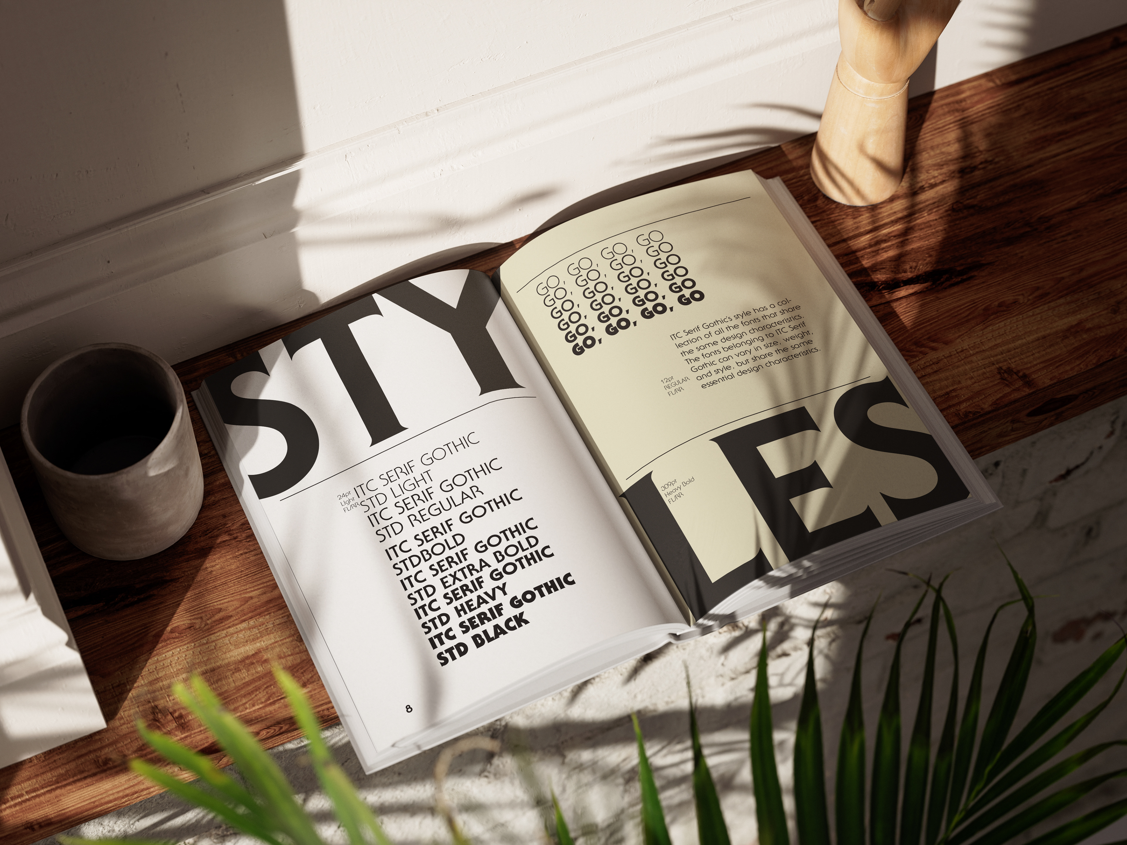
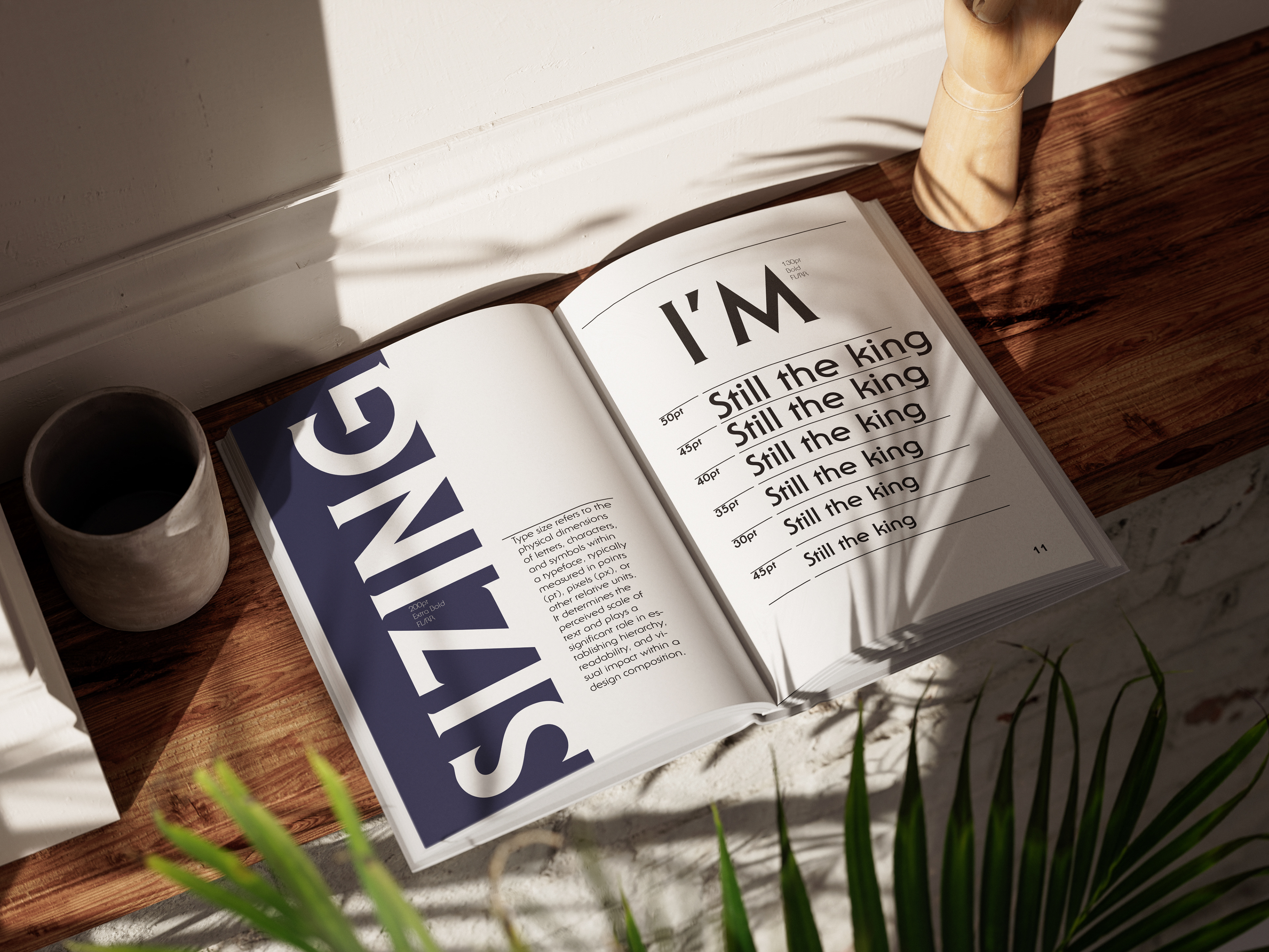
My favorite part of this project was designing the title treatment. I loved letting the typography extend across the spread, creating a strong sense of motion, continuity, and visual impact that set the tone for the entire book.